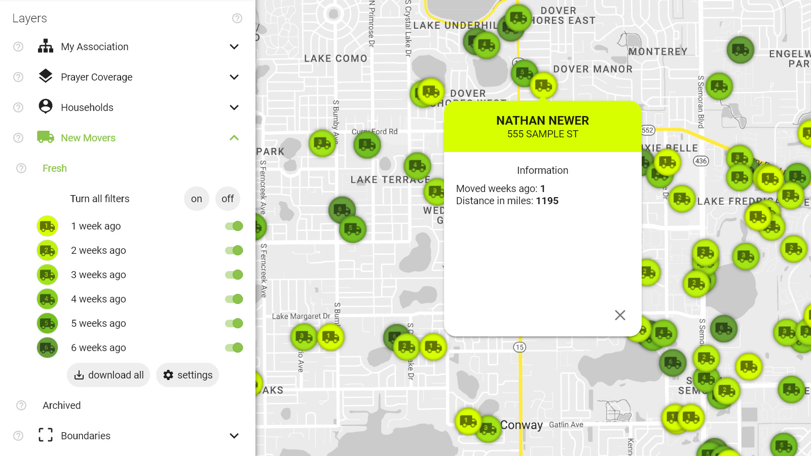
This map layer and filter displays the people who recently moved into your community. It is updated with new movers every week. Icons on the map are color coded and may be filtered according to the number of weeks ago they moved in.
Clicking any of the icons opens an info-box that features the name, address, and distance of move of that new mover, as well as approximately how long ago that record was added to your account.
Using this together with other map layers such as your Lights and homes adopted by your organization, provides an extraordinary visual overview of your complete mission field, and allows you to make strategic decisions on how to target new residents of your community.