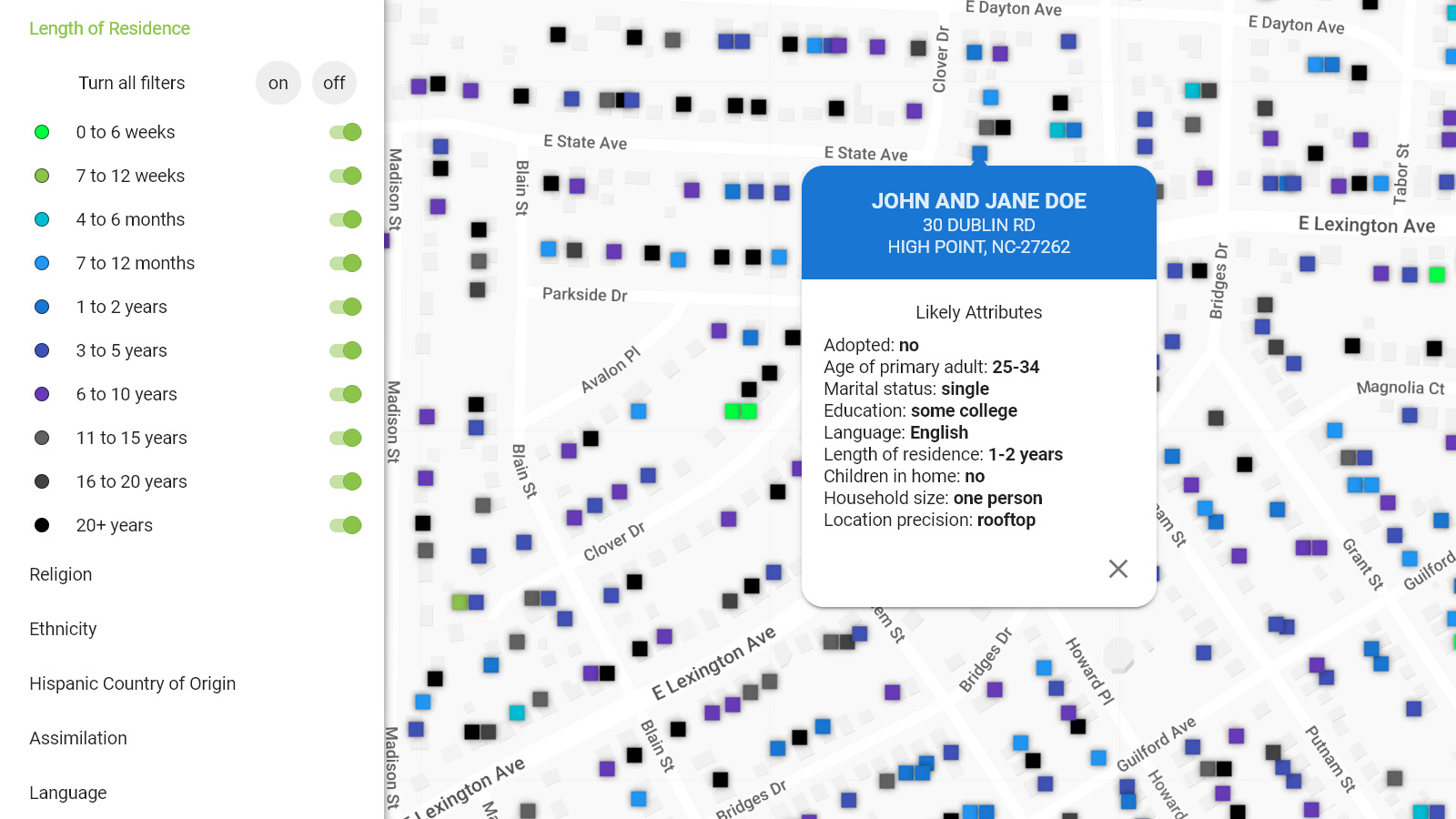
This map layer and filter shows all the homes on the map color coded according to the probable length of time that the primary adult has lived there. The colors for this filter form a temperature gradient. Warm colors such as red show households with a shorter length of residence. This allows you to see where the newest movers are located.
You can filter the displayed homes using the following categories:
These filters can be combined with other demographic filters to precisely define your target group.
Clicking on a home on the map will bring up the name of the residents, the address of the home and several demographic attributes like age, marital status, education level, language, length of residence, number of children in home and household size.
All household level demographic attributes are based on either publicly available or self-reported information and the application of highly sophisticated anthroponomastic algorithms.